The Free Library of Philadelphia
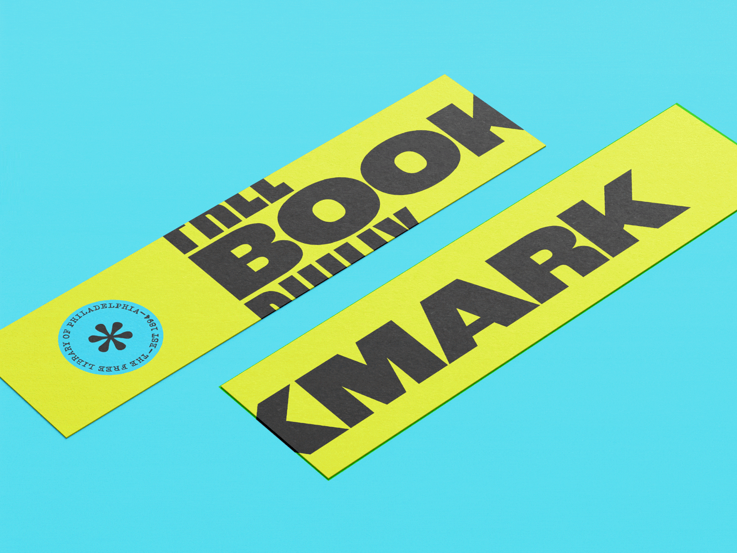
When beginning this rebrand, I remember going on a walk here in Philadelphia, wondering what form this identity would take. Then, someone driving on the street, leaned into their horn…I mean really leaned. It was so loud. A phrase went through my head, “Libraries are quiet, but Philly is loud!” With neon colors and bold typography that escapes the page, this new library identity evokes the personality of Philadelphians. I used a typewriter font for the body copy and emblem logo, referencing the return date stamps in the back of library books. The symbols for the emblem logo come from the glyphs of Caslon. Ben Franklin was known to use Caslon in his print shop here in Philadelphia. These marks bring an additional level of history and personality to the brand.